Menu (Main Menu, Mobile Menu)
Menu locations (selecting menus on website)
Loyde defines multiple menu locations:
- Primary Menu
- Top Navigation
- Footer Navigation
- Divided Menu - Left
- Divided Menu - Right
More menu locations can be added by 3rd-party plugins.
For each of these menu locations, it's possible to select a menu. Note: After importing the theme demo, most of the menu locations will already have selected menus.
Primary menu
Menu selected under "Primary Menu" is displayed in:
- Default header (if it's displayed, see here)
- On pages, if selected in our custom Menu WPBakery element (more info here).
Footer Navigation
Menu selected under "Primary Menu" is displayed in:
- Default footer (if it's displayed, see here)
- On pages, if selected in our custom Menu WPBakery element (more info here).
Divided Menu - Left
Primary purpose: to better accommodate "divided" menus. A "divided" menu is layout where two parts of menu are split e.g. a logo. That enables the layout where the logo is in the middle and menu items are left and right from it. This menu gives better flexibility to the user, to decide which menui items will be left, and which wil be right from the logo.
Divided Menu - Right
Primary purpose: to better accommodate "divided" menus. See details under "Divided Menu - Left".
Customizing menu styles
It's possible to customize different visual aspects of menus on website. This includes:
- Menu (e.g. main menu in header)
- Mobile menu
Menu

It's possible to customize:
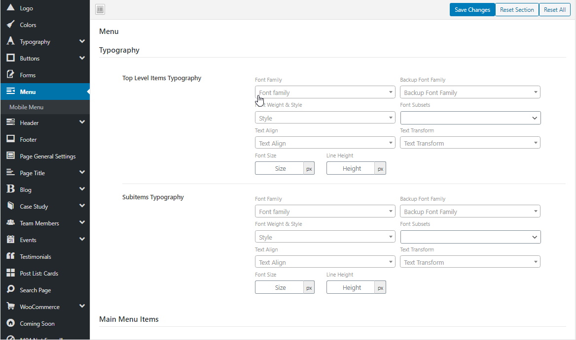
- typography (font family, font size, ...)
- colors (regular and hover colors, background color)
- spacing (paddings, margins)
Styling can be set to different levels of menu items hierarchy:
- main menu items (menu items of the highest order)
- current menu item (applies to the current item on all levels of hierarchy, i.e. top-level menu item together with the lowest level submenu item).
- submenu items (menu items placed below the top-level menu items).
Choose styles for the menu
Steps:
- Go to WP admin -> Loyde -> Theme Options -> Menu
- Choose desired settings.
Mobile Menu
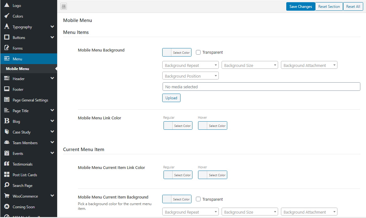
Mobile menu is displayed on smaller screen sizes. It can be styled separately from the regular menu.
Settings are almost identical to the "Menu" settings. However, there is one additional setting: "Toggle Icon". This setting applies to the "hamburger button", i.e. the button on pages which opens the mobile menu on tap/click.

Choose styles for the mobile menu
Steps:
- Go to WP admin -> Loyde -> Theme Options -> Menu -> Mobile Menu
- Choose desired settings.
Replace hamburger icon with a custom image
By default, the mobile menu button is represented with the "hamburger icon" symbol. But, it's possible to change this, by choosing an image.
To choose an image for the mobile menu button:
- Go to WP admin -> Loyde -> Theme Options -> Menu -> Mobile Menu
- Under Display Toggle Image, choose an image from the Media section
- Optionally, enter image sizes under Display Toggle Image Dimensions (Width/Height).