Custom WPBakery Page Builder Elements (Added by the Theme)
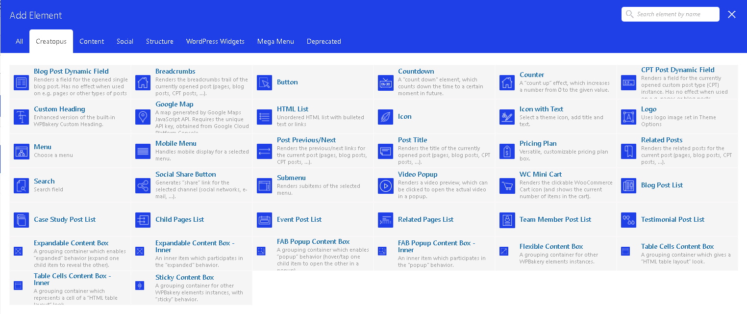
Where to Find Loyde Custom Elements
Our custom WPBakery Page Builder elements can be found at two places:
- under the "General" tab, together with all other elements (built-in and 3rd-party WPB elements);
- under the "Creatopus" tab.

Custom WPBakery Page Builder Elements
- Breadcrumbs: Renders the breadcrumbs trail of the currently opened post (pages, blog posts, CPT posts, ...).
- Button
- Countdown: A "count down" element, which counts down the time to a certain moment in future.
- Counter: A “count up” effect, which increases a number from 0 to the given value.
- CPT Custom Field: Renders a selected custom field for the currently opened custom post type instance. Has no effect when used on e.g. pages.
- Google Map: A map generated by Google Maps JavaScript API. Requires the unique API key, obtained from Google Cloud Platform Console.
- Icon
- Logo: Uses logo image set in Theme Options
- Icon with Text: Select a theme icon, add title and text.
- HTML List: Unordered HTML list with bulleted text or links
- Menu: Choose a menu
- Mobile Menu: Handles mobile display for a selected menu.
- Post Previous/Next: Renders the previous/next links for the current post (pages, blog posts, CPT posts, ...).
- Post Related Posts: Renders the related posts for the current post (pages, blog posts, CPT posts, ...).
- Post Title: Renders the title of the currently opened post (pages, blog posts, CPT posts, ...).
- Pricing Plan: Versatile, customizable pricing plan box.
- Search: Search field
- Social Share Button: Generates “share” link for the selected channel (social networks, e-mail, ...).
- Single Post Field: Renders a field for the opened single post. Offers only common fields: title, content, excerpt, ...
- Submenu: Renders subitems of the selected menu.
- Video Popup: Select a theme icon, add title and text.
- WC Mini Cart: Renders the clickable WooCommerce Cart icon (and shows the current number of items in the cart).
- Content Box: A grouping container for other WPBakery element instances.
- Expandable Content Box: A grouping container which enables “expanded” behavior (expand one child item to reveal the other).
- Popup Content Box: A grouping container which enables “popup” behavior (hover/tap one child item to open the other in a popup).
- Sticky Content Box: A grouping container for other WPBakery element instances, with “sticky” behavior.
- Table Layout Content Box: A grouping container which gives a “HTML table layout” look.
- Blog Post List
- Case Study Post List
- Event Post List
- Team Member Post List
- Testimonial Post List
- Child Pages Post List
- Custom Heading: Enhanced version of the built-in WPBakery Custom Heading.
Each Loyde custom element serves a different purpose. However, they can be roughly grouped into several categories:
- Simple elements
- Complex elements
Main types of complex custom WPBakery elements
Content Boxes
Content Boxes are a specific subgroup of Loyde custom page builder elements. They are used to group and manipulate other WPBakery page builder blocks. Among other settings, it's possible to adjust horizontal and vertical alignment of the content (contained elements inside). This is enabled due to reliance on "flexbox" CSS model.
More information can be found here.
Post Lists
Post lists are a specific subgroup of Loyde custom page builder elements. Their purpose is to display a card-like list of posts, like e.g. blog posts, case studies, events, .... Post lists offer a rich and powerful set of settings:
- controlling the number of displayed posts
- choosing number of columns
- selecting and reordering fields used in posts cards
- etc.
More information can be found here.
Powerful additional features common for multiple WPBakery Elements
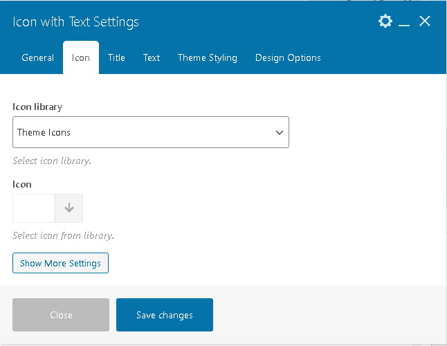
Some custom WPBakery elements offer built-in possibility to set a few different pieces of information, for example an icon and a piece of text. That way, all these pieces of information are grouped together, and are displayed (and manipulated) as part of that element on page.
An excellent example for this is "Icon with Text". These additional elements are some (or all) elements from this list:
- icon
- title
- text (or "body" of the control).
This way, custom WPB elements offer powerful possibilities to quickly and easily enable or disable any of these fragments, as well as perfectly control their interaction (order and alignment).
