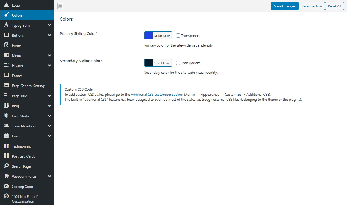
Colors
Loyde recognizes two site-wide accent colors:
- Primary
- Secondary
More information here.

Primary- and Secondary Styling Color
Primary and secondary colors affect a number of visual color styles throughout the site: menu items, hover effects of elements, icons…
Purpose of this feature is to quickly and easily change overall color scheme, enabling you to customize site colors according to your visual identity.
Applying primary- and secondary accent colors with CSS classes
Theme design applies primary/secondary color to several predefined UI elements.
But if it's necessary to apply priamry/secondary color to any new UI element (a part of the theme demo, or an element added by a 3rd-party plugin), it can be done using these CSS generic classes:
- .crea-primary-color
- .crea-primary-color-text
- .crea-primary-color-hover
- .crea-primary-color-important
- .crea-primary-background
- .crea-primary-background-color-hover
- .crea-primary-color
- .crea-primary-color-border
- .crea-primary-color-background-gradient-before
- .crea-primary-color-background-gradient-before-hover
- .crea-primary-color-background-gradient-before-toright
- .crea-primary-color-background-gradient-before-toright-hover
- .crea-primary-color-background-gradient-before-toleft
- .crea-primary-color-background-gradient-before-toleft-hover
- .crea-primary-color-background-gradient-before-totop
- .crea-primary-color-background-gradient-before-totop-hover
- .crea-primary-color-background-important
- .crea-primary-background-hover
- .crea-primary-color-fill
- .crea-sec-color
- .crea-secondary-color-border
- .crea-secondary-color-background-gradient-before
- .crea-secondary-color-background-gradient-before-hover
- .crea-secondary-color-background-gradient-before-toright
- .crea-secondary-color-background-gradient-before-toright-hover
- .crea-secondary-color-background-gradient-before-toleft
- .crea-secondary-color-background-gradient-before-toleft-hover
- .crea-secondary-color-background-gradient-before-totop
- .crea-secondary-color-background-gradient-before-totop-hover